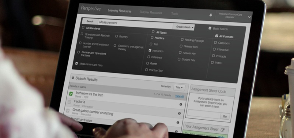
Perspective host tens of thousands of printable materials, videos, games, and other resources that are aligned with the common core standards in Mathematics and English Language Arts. It allows educators to quickly assemble assignment sheets that can be distributed via email and accessed by the student via the Perspective experience.
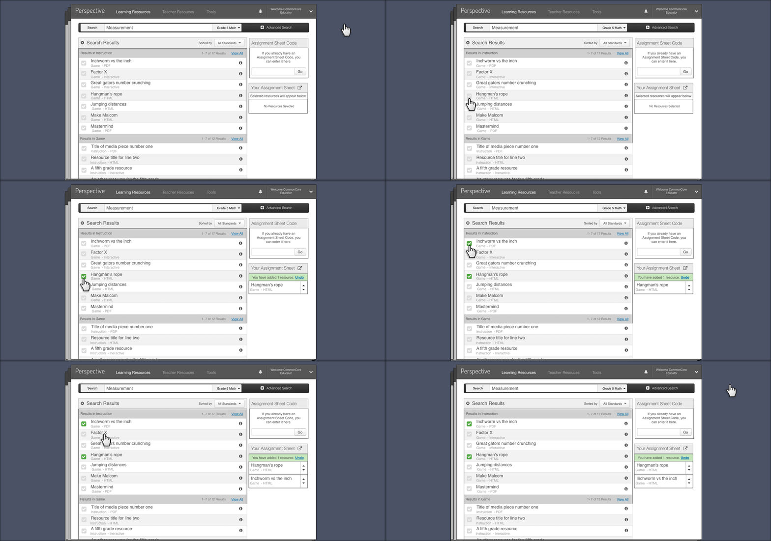
I utilized a shopping cart style of interaction to accommodate the creation of the assignment sheet. In user testing, this performed really well. Confirming this is a familiar mental model with most users.
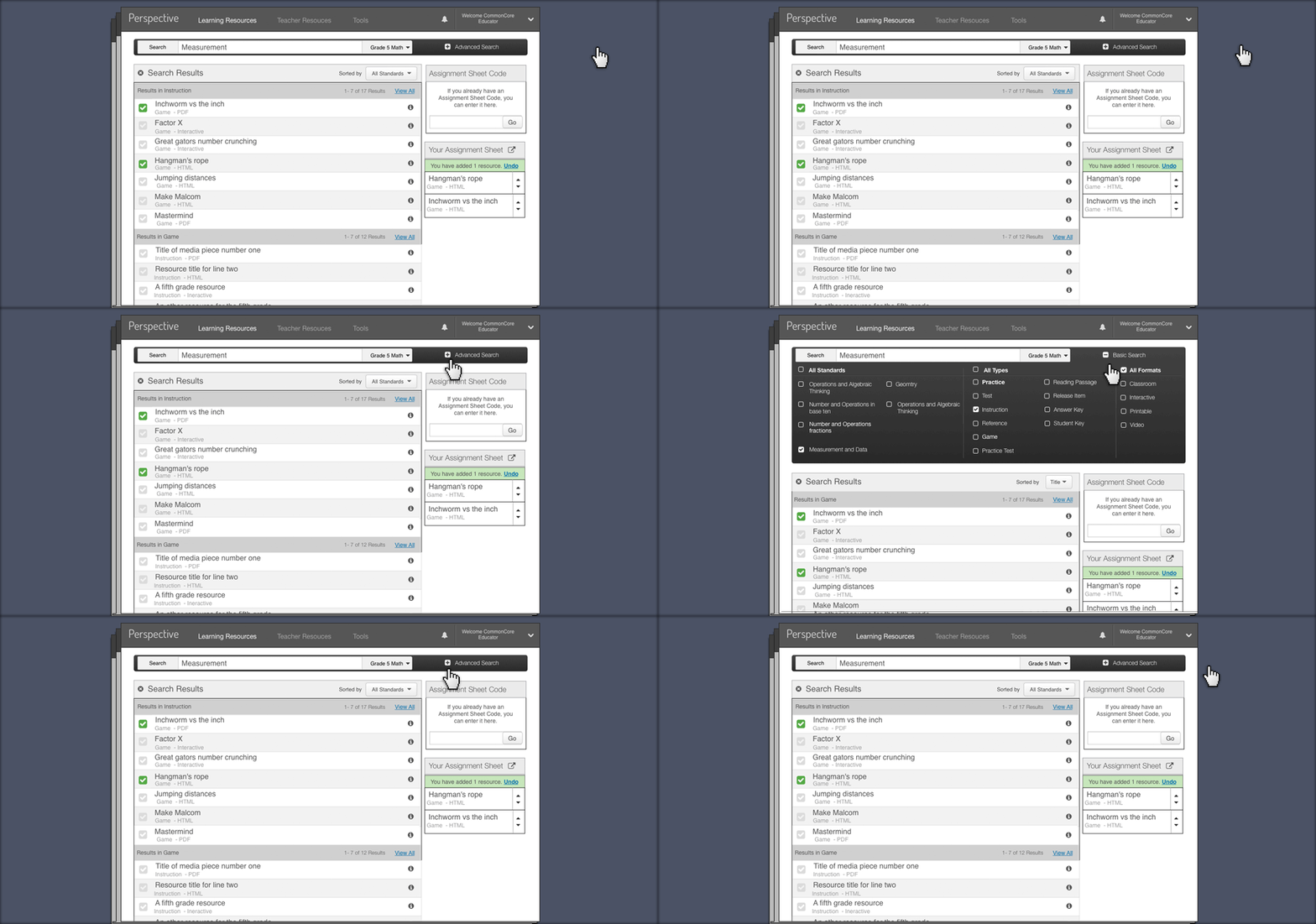
Working with a UX Researcher, we discussed the various search patterns available to us within the scope of the schedule and budget. I designing a more robust search, that featured categorized search results and advanced search filters.
Project Overview
Hypothetically, let's say you're an elementary teacher. You have students that are performing very differently on standards covered in a lesson. You divide them up into groups. Ideally, you'd like to assemble the homework for each group so that it aligns with the standards each group is performing poorly in. Perspective aims to serve that need. Perspective host tens of thousands of printable materials, videos, games, and other resources that are aligned with the common core standards in Mathematics and English Language Arts. It allows educators to quickly assemble assignment sheets that can be distributed via email and accessed by the student via the Perspective experience.
My Role
Working with the UX researcher, the lead developer and the project manager we discussed the various search patterns available to us within the scope of the schedule and budget. I designed a more robust search that featured categorized results and advanced search filters. In addition to that, I utilized a shopping cart style of interaction to accommodate the creation of the assignment sheet. Knowing this is a familiar model with most users, in testing this performed really well.
You may notice the search button on the left side of the search field. This is not a familiar UI Pattern. My director asked that I test this with users based on this article supporting a left sided search button. I was skeptical. I knew users would still understand what to do with the button, but thought it would "throw them off" some how. To my surprise, not one user questioned it or stumbled on it. There's always more learn.