
Project Overview
During this project I was employed at Pearson North America, on a product team in the Assessment and Instructions department in Iowa City. CrowdScore was in the early stages and needed structure and definition. It had a small budget and a narrow window of time for development. The work demonstrated here was completed between July-Sept of 2013.
My Contribution
While working closely with the product team I quickly came to an understanding of the project. I was responsible the following tasks:
- - The complete UX design
- - Scheduling meetings and leading discussions
- - Designing the architecture of the site
- - Providing a prototype with which to conduct user testing with
The Wisdom of a Crowd
There are several studies that suggest: a crowd's estimations, when averaged, perform better than one individual's estimation. Applying this methodology to grading a written response is the idea behind CrowdScore. Many of today's online classes consist of hundreds of students. Peer reviews have quickly become a way to accommodate the growing class sizes. With CrowdScore, an administrator is able to appoint multiple evaluators or students to perform peer reviews.
How Do We Create a More Accurate Way to Score a Written Response?
The Traditional Method

1 Submission receives 1 evaluation
The Traditional Method often produces a biased score or inconsistent scoring across multiple submissions
The CrowdScore Method

1 Submission receives multiple evaluations
The CrowdScore Method ideally provides a more accurate and consistent scores on a written response
The Users
The primary demographic is higher education. This service streamlines scoring written responses only. No other academic information is being viewed or submitted via CrowdScore. There are three types of users:
-
The General User

A student who's needs are simply to submit a response to an assignment. CrowdScore allows for hand-written submissions in the form of a picture or a scan.
-
The Evaluators

These are the users that will be scoring the responses.The users are either peers from a course or an appointed evaluator, such as another educator.
-
The Administrator

This is an educator or institution official who creates and manages the courses, assignments, rubrics and evaluators.
Planning
The development team for CrowdScore was given a very specific start date. I created the UX workflow and schedule so the development team was given enough direction to start with the administrator's use cases. I knew that at least one round of user testing on the prototype was necessary in order to validate the design and make needed refinements based on the user's feedback. Based on this fact, there were four milestones to accomplish in the next seven weeks. They were as follows:
Milestones
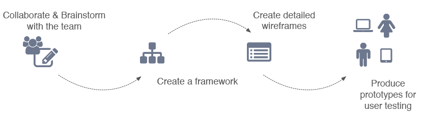

Collaborating with the team
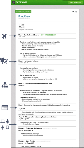
At Pearson, I often worked with teams that were in another state, or in some cases, another country. It was very important that I keep everyone up-to-the-minute on the latest wireframes and where they can be obtained. Evernote has a share feature that allows the team to bookmark the shared note's location in their browser and stay up to date on my progress and the schedule.
Looking to create both transparency and accountability in my planning, I took those milestones and outlined them across seven weeks in Evernote. Each step of the schedule drove the design process toward user testing. As I completed each step I would update the note with links to download the latest wireframes.
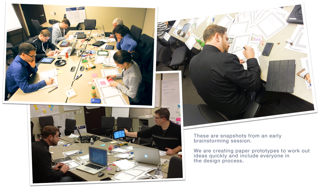
As I mentioned, the team was based in another state, so traveling to meet and work with them face to face was an essential first step. Below is an early brainstorming session I lead. We were working on some paper prototypes.

Creating The Framework
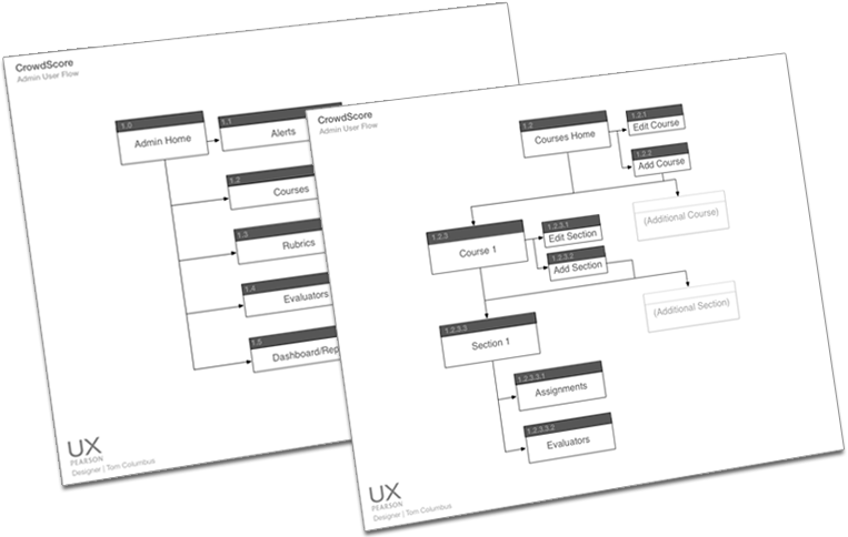
In order to account for the complete structure of the site and discuss requirements, I constructed site maps to review with the team. There was not going to be enough time to design every screen so the development lead and I decided to utilize the Bootstrap CSS for most of the front end UI elements. This allowed me to focus on creating wireframes for more complex interactions.
Applying a simple numbering system to each screen helped the entire team stay in sync with how the pieces were related and what screens transitioned into others.

Creating Detailed Wireframes
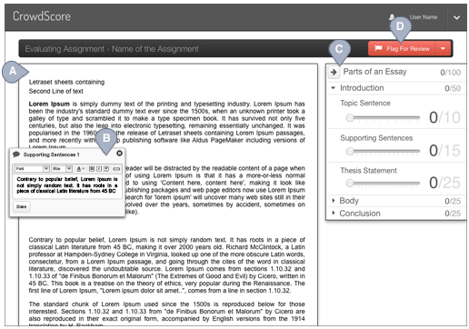
Sequential Screens Demonstrating Evaluating A Response
In this series of screens, I break down how the rubric's scoring mechanism works. The user in this example is evaluating with a rubric entitled Parts of an Essay. The rubric has three sections: Introduction, Body, and Conclusion. Within each category lies the individual traits the user will be scoring.
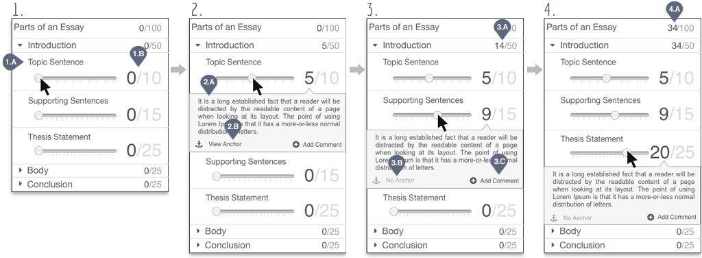
- 1.A Represents the trait the user is scoring with that slider. In this case, it's the Topic Sentence.
- 1.B The number of points awarded vs possible points for that specific trait.
- As the user drags the slider, we move on to the next screen. You'll notice that the area below the trait has expanded to reveal some text.
- 2.A Represents the criteria or explanation of what constitutes a five out of ten on a Topic Sentence.
- 2.B An "Anchor Answer" is an example of a trait (i.e. topic sentence) that is written well enough to be scored a 5/10.
- 3.A Displaying the sum of the traits scored thus far.
- 3.B Lets the user know that there is no anchor answer available for this trait.
- 3.C Allows the evaluator to leave a comment for the author of the response regarding the score given.
- 4.A Upon scoring the three traits that are listed under the Introduction category, the overall points are now totaled.

User Testing
We user tested two scenarios. The first was for the administrator use case; setting up courses and managing evaluators. The second scenario was for the evaluation of a response. Below is an example of the prototype users performed in a mock evaluation within our user testing. We tested the prototype with a total of seven users and received great feedback that guided us toward simplification and clarification of the program overall.
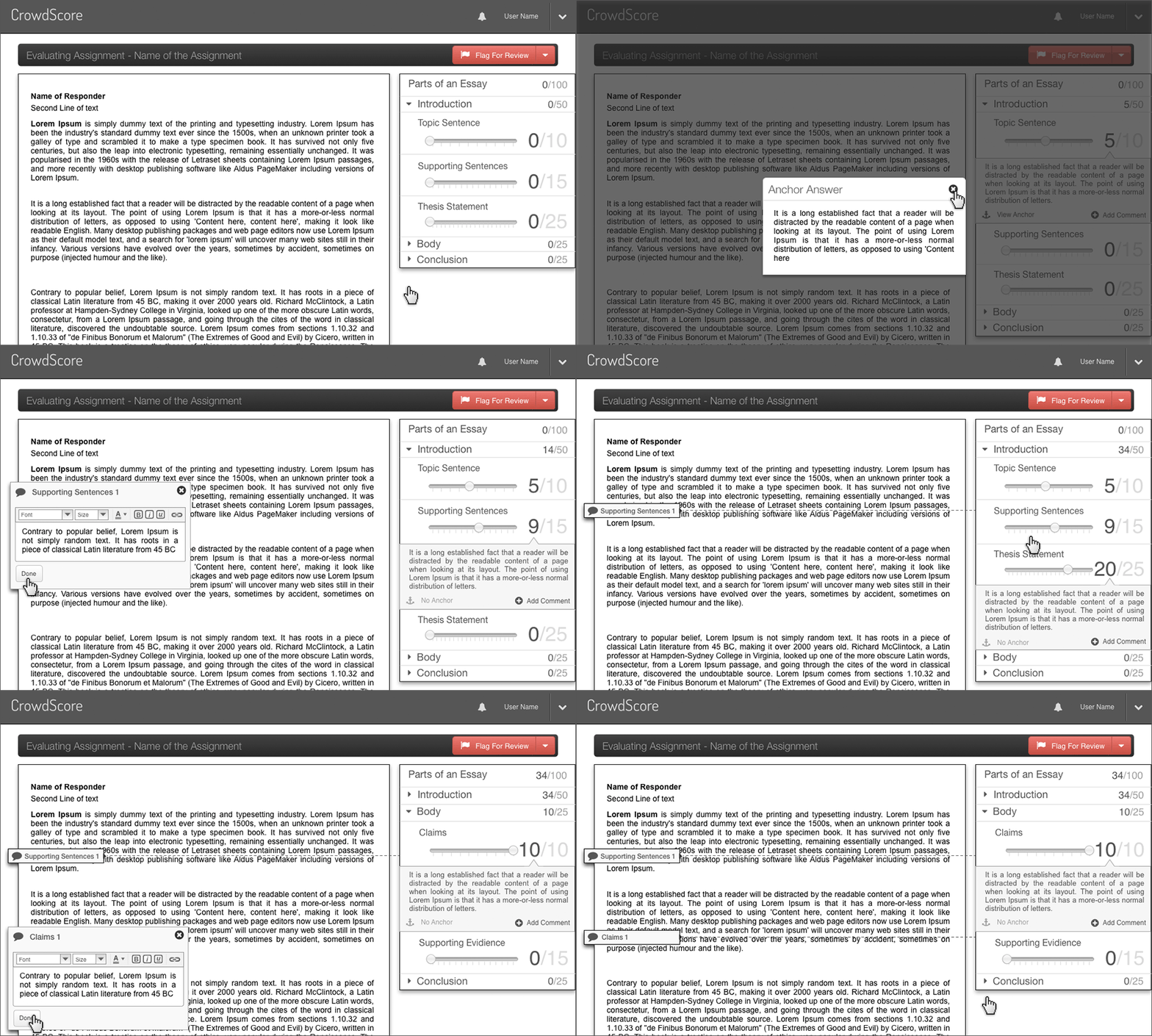
This animation is demonstrating how an evaluator would score a student submission, view an anchor answer and leave comments to the student. In order to provide the student context for the evaluator's remarks, the comments are labeled automatically with the title of each trait in the rubric.
Refinement
User testing is invaluable. It serves to validate the design with the people whose opinions matter the most; the users. It also dispels all the assumptions that the team develops while producing the initial design. The results of our user test validated the parts we got right and highlighted the areas for improvement, as well. The users liked scoring with the slider and found the interface very easy to use. However, we heard from multiple users that they wanted more access to the rubric itself while determining the score. We changed it accordingly. The new design now offers the ability to see more of the rubric at a time. We've also added multiple views for the user, such as:
- - Scoring View
- - Rubric Only
- - Response Only
- - Response & Comments
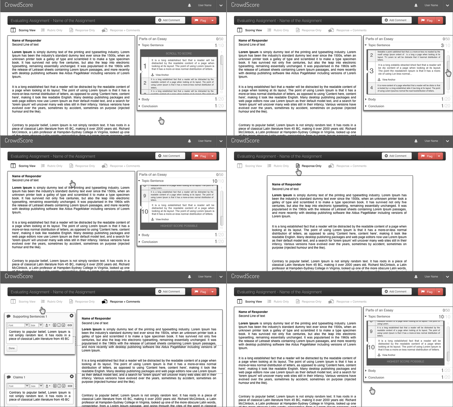
This animation is demonstrating the refined design. Based on user feedback we now show more of the rubric while scoring a trait in this new "scroll to score" model.
The primary interaction in CrowdScore is evaluating a response. This was the interaction I wanted most to test with users. I created multiple wireframes demonstrating different approaches to scoring.
The image Evaluation Screen represents an evaluator's view while scoring a response.