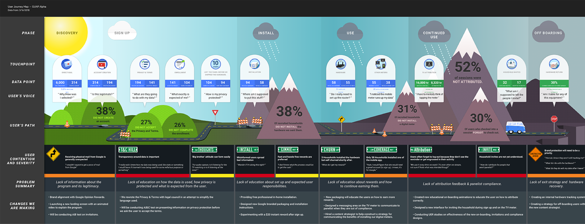
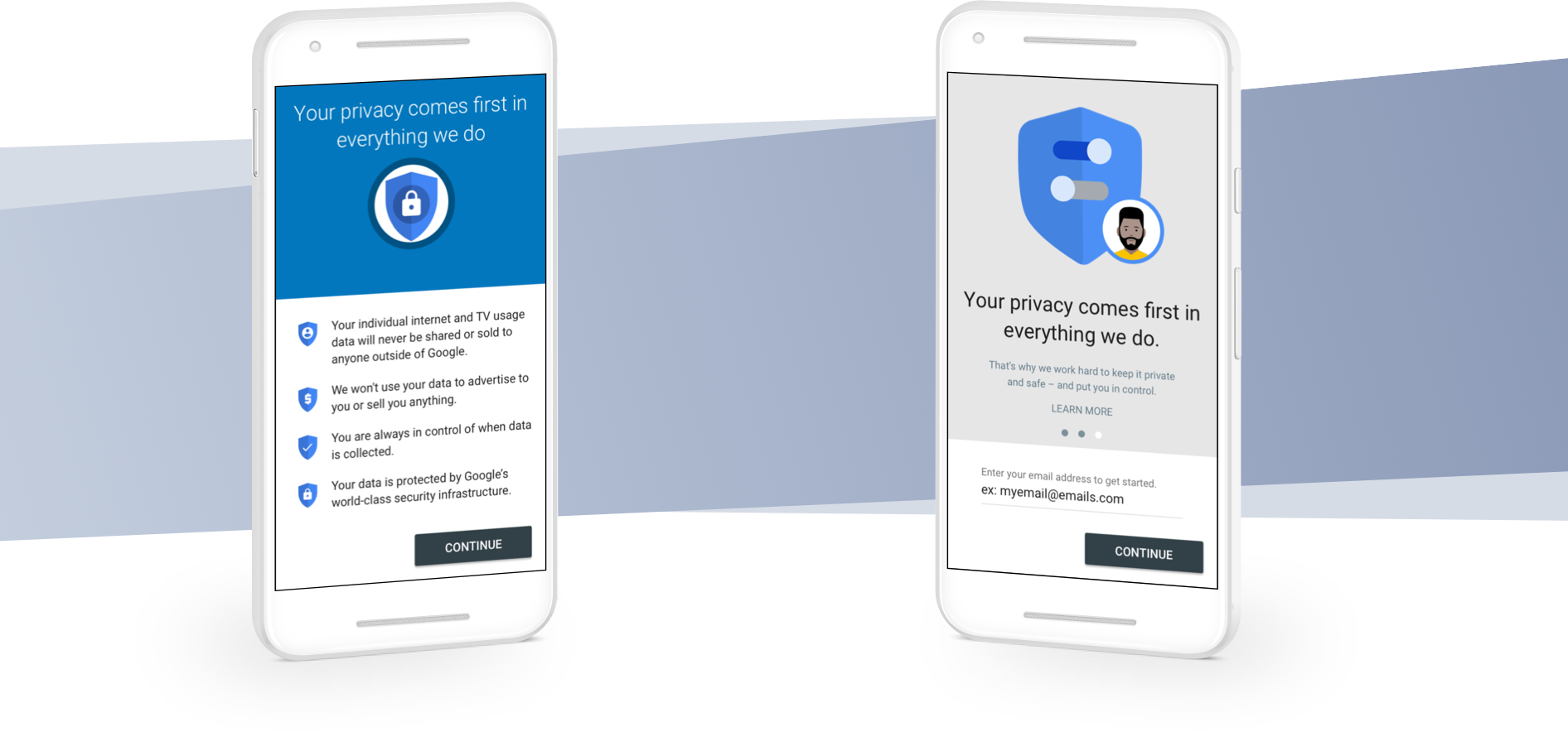
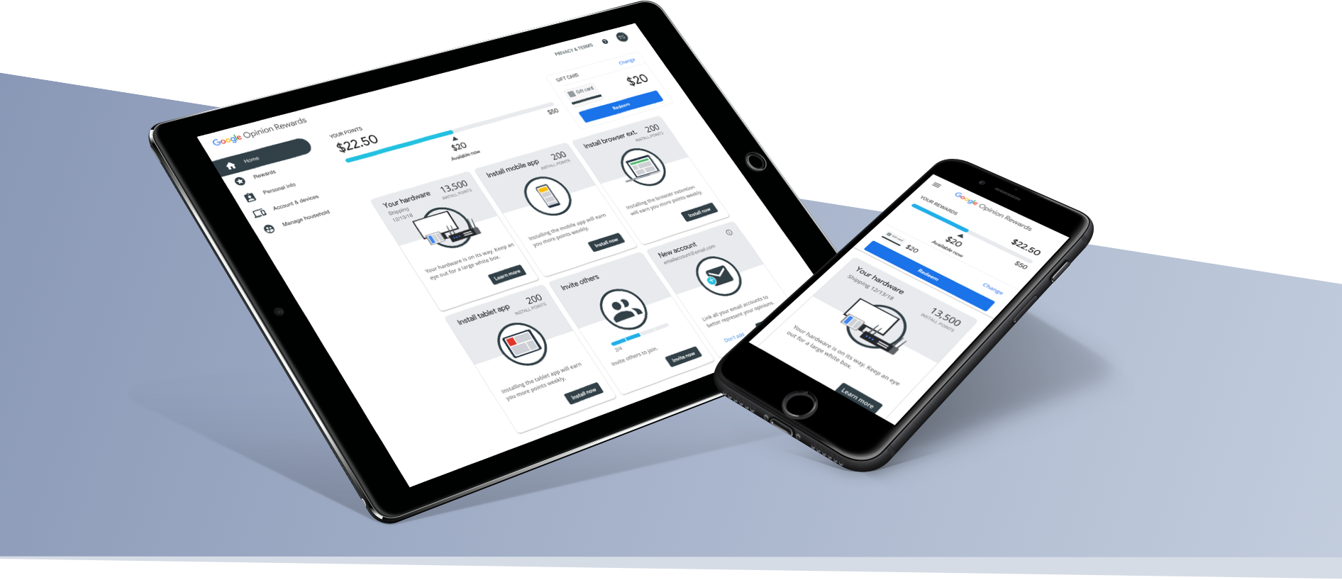
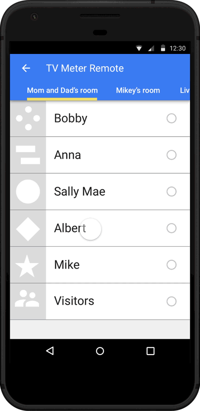
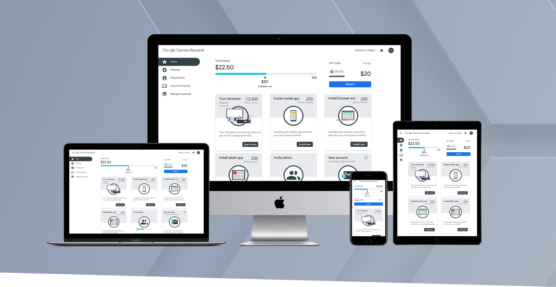
Google Case Study || Tom Columbus
Google Opinion Rewards

Google Opinion Rewards

In this early-stage research program, users earn rewards for sharing their TV and internet consumption. The program draws comparison with Nielsen's ratings for TV, but Google’s program goes farther, seeking to measure media viewership across multiple devices and touchpoints. My contributions helped shape the 2018 rebrand and sign-up experience. Here are just a few examples of the improvements we shipped.

My Role

Interaction design
Prototyping
Visual design
Motion design
3P Art direction


Challenges

  • Not enough people were signing up for the program

  • The initial sign-up UI consisted of form elements that were not mobile friendly

  • There wasn’t enough information about what the users were signing up for to inform their decision


  • The account management screen failed to identify user rewards, and present clear calls to action

  • Designing across multiple touchpoints
    (Apps, Hardware, Web)

  • Users watching TV were not attributing themselves


Approach

Gain understanding:

Learn the user’s mental model and add analytics to the sign-up process

Communicate and collaborate:

Create an end-to-end journey map to convey UX needs to key stakeholders

Advocate for the user:

Identify and alleviate pain points in the journey that would make the biggest impact

Results

  • Increased account creation by 11% by optimizing the sign-up process

  • Increased TV viewership attribution by nearly 30% through improved interaction design

  • Increased usability of the account management experience through responsive, user-centered design


Learning the mental model

I joined the team just a few weeks before their Alpha launch and it was obvious that there was a need for some short term, tactical changes and some long term, strategic initiatives to advocate for.

The program invites users to sign up and share their media viewing habits in return for rewards. To understand people's motivations for joining or not joining the program, I did some early user testing around copy. I suspected that providing an overview of the program and how it works, would help users make the decision to join.

Presenting a program overview

From this research, I identified phrases that aligned with people’s desires to contribute to a program like this. The PM and I collaborated to craft a rough script for an animated introduction video. Working with the team's marketing lead, I contributed art direction for the third party team that created the animated video through multiple script and scene revisions.

Old sign-up design

Redesigning the sign-up

The initial design for the sign-up experience consisted of a few screens with long forms to fill out. The presentation of these forms was not practical for mobile users, and the design was not compelling. To create a more usable experience, I broke out each form element into its own screen.


I designed a mobile friendly, visually engaging screen for each question and added a few informational screens to help set the user’s expectations. To measure the effectiveness of each piece of the process, I worked with the team to apply analytics to each step of the sign-up flow. This allowed us to gather information about how each question in the sign-up funnel was performing.


New sign-up screens

Communicate & Collaborate

When we gathered the analytics from this first round of improvements, I organized a UX Sprint to help the team discover opportunities and obstacles that existed in the current experience. We created numerous sketches and wireframe examples to test with users and get feedback on.

Based on the learnings gathered from the UX sprint and our new sign-up analytics, the UX researcher and I created a detailed visual User Journey Map to highlight the problem areas of the end to end user experience.

Continued Improvement

After establishing a baseline for how each step of the funnel was performing, the program manger and I formulated a plan of action. By focusing on the steps of the sign-up that were experiencing the most drop off, we were able to make improvements to screens that were underperforming and track the results of those changes.


Based on the learnings gathered from the UX sprint and our new sign-up analytics, the UX researcher and I created a detailed visual User Journey Map to highlight the problem areas of the end to end user experience.

New privacy screens

Redesigning Account Management

Once a user joins the program, there are a few things that they needed to do in order to complete their membership and manage their account. I redesigned the existing website to be responsive for both desktop and mobile users.


The new design focused on providing the user with a path to review their current reward balance and a way to quickly redeem the rewards for gift cards. I moved the tasks that a user needed to complete, in order to set up their entire account and earn more rewards, into a card based UI that displayed each task and the reward earned for completing it.

New account management screens

Improving TV Attribution

The program measures TV viewership using a device called a TV Meter. This device needed to be positioned next to the TV in order to function properly. When a TV program was identified, the user was required to walk up to the device and select their name to attribute who in the house was watching. As you can imagine, this was inconvenient for a user sitting on the couch several feet away from the TV.


Working closely with the mobile app engineering team, I designed a simple interface to allow the user to attribute themselves and others via their mobile device. This remote control function made a huge impact on TV attribution. The new feature was widely adopted and praised by the users.


TV Meter Animation

To complete the feedback loop and let the user know that the TV meter had received the action taken from the app, I created an animation that would be visible on the TV meter from across the room.

This animation is part of a larger prototype I built of the TV Meter's interface. I built the prototype in Framer JS. It utilizes the web-kit animation properties and translates to CSS seamlessly, so that the engineer was able to code the animation by simply using the same values I did.

Conclusion

Redesigning the sign-up experience to educate and entice the user, by presenting the right information at each step, increased sign-up and engagement.

Reducing the effort needed to correctly use the TV Meter increased engagement and accuracy.


This required proposing new functionality and new designs to align the experience with what came naturally for the user and proved to be exactly what our product needed to successfully move from Alpha to production.

Thanks for reading.